Analytics
The Desk dashboard: what every number means, from volume and close time to coverage and patient engagement.
The Desk is Novapulse's analytics dashboard. It shows how busy your inbox has been, how fast your team is responding, how much time the product is saving you, and who on your team is showing up. You can view it for your whole hospital, a single practice, or a single workgroup. Every teammate also gets a personal My Analytics view.
This page explains each tile, chart, and column on the Desk. For each one you'll see what the number means, what time window it covers, and why it might sometimes look surprising.
Opening the Desk
Click Desk in the sidebar. What you see depends on where you are:
- At the hospital level, the Desk combines every practice you have access to.
- Inside a practice, the Desk shows just that practice.
- Inside a workgroup, pick a workgroup from the tabs at the top to narrow it further.
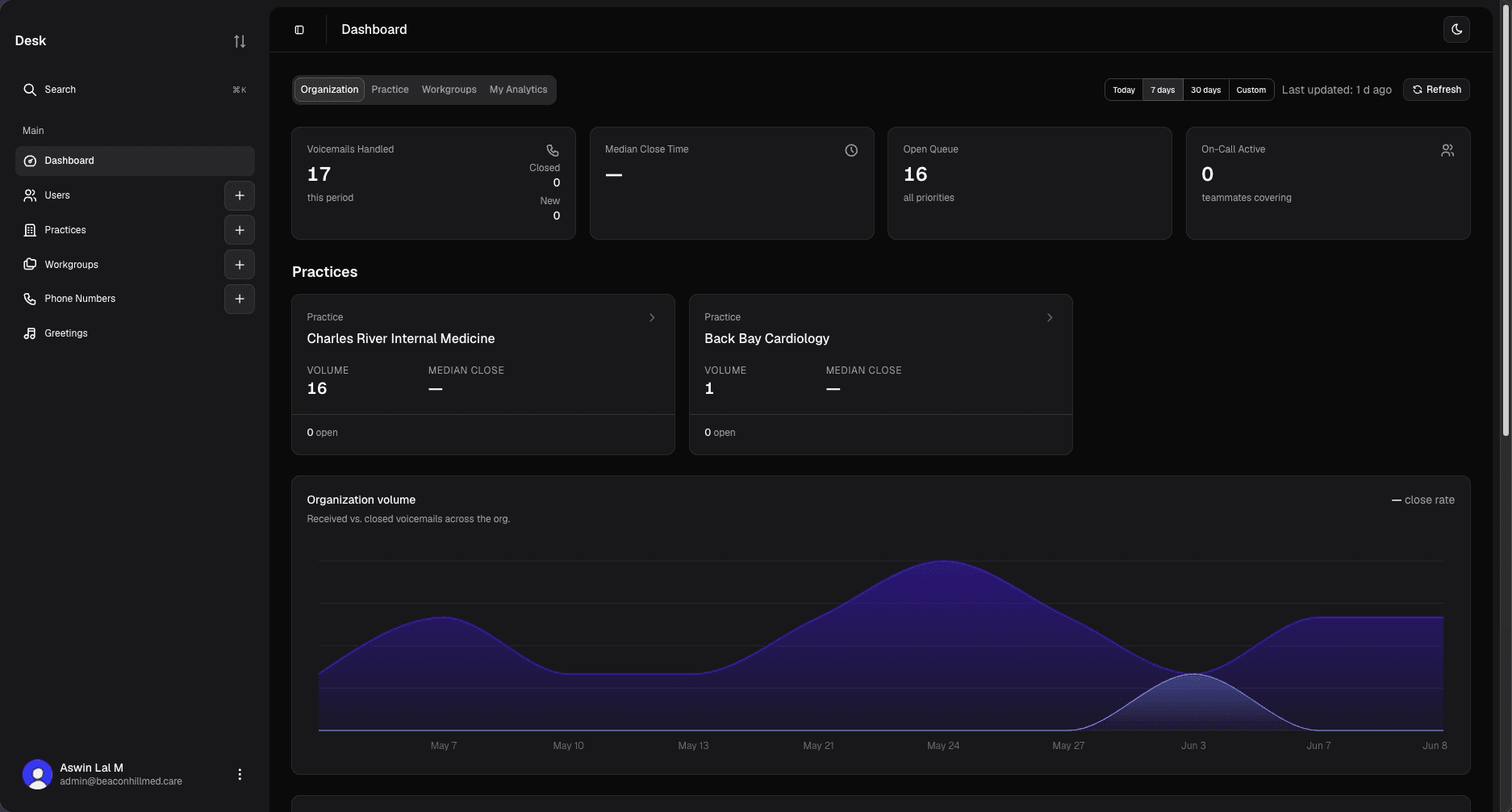
Which tabs you see depends on your permissions. The Organization view needs org level analytics access, the Practice and Workgroup views need the matching access, and everyone can see their own My Analytics.
Period filters
At the top of the Desk there's a period selector:
- Today: from midnight (UTC) today until now.
- 7 days, 30 days, 90 days: a rolling window ending right now. "7 days" means the last 168 hours, not this calendar week.
- All time: everything since you started using Novapulse.
- Custom: pick any start and end date.
Switching the period re-runs every metric on the page. All time loads instantly from saved snapshots. The other periods are calculated live and take a second or two.
Two tiles ignore the period selector because they describe right now, not a past window: Open Queue and On-Call Active. Changing the period won't move them. Everything else on the page responds to the period, with one exception: Active two-way conversations always looks at the last 7 days. Each is called out below.
The top numbers (KPI tiles)
These are the four large tiles across the top of the Organization view. The Practice and Workgroup views show a subset of the same tiles.
Voicemails Handled is how many voicemails came in during the period, counted by when they were received. Two smaller numbers break it down:
- Closed: of the voicemails received in this period, how many are now closed. Because it counts the same set of voicemails, Closed is never larger than the headline number.
- New: how many voicemails are currently unread across the whole view. This is a live count and is not tied to the period.
When you're not on All time, the tile also shows a percentage change against the previous window of the same length, for example this 7 days versus the 7 days before it. It's blank on your first period, and whenever the previous period had no voicemails to compare against.
Median Close Time is the typical time from a voicemail arriving to it being closed. Median means the middle of the pack: half your closed voicemails were faster than this, half were slower. We use the median instead of the average so that one voicemail left open for a week doesn't pull the whole number up. It's blank when nothing was closed in the period.
Open Queue is how many voicemails are open right now: opened but not yet closed. The line underneath shows how many of those are high priority (tagged URGENT or HIGH), and the tile turns amber when there are any. This is a live view of your current workload, so it does not change when you change the period.
On-Call Active is how many coverage sessions are running right now, meaning how many teammates are currently covering for someone who's away. It's also live and not affected by the period.
Practice and workgroup cards
On the Organization view, each practice gets a card. Inside a practice, each workgroup gets one. The cards let you compare at a glance and click through to that practice's or workgroup's own Desk. Each card shows:
- Volume: voicemails received by that practice or workgroup in the period.
- Median close: that group's typical close time.
- Hours saved: see Hours saved below.
- Open: how many voicemails are open right now, with a high priority badge when any are urgent.
The Organization view lists the top 50 practices by volume. Very small practices may not appear on the cards, but they're still counted in the org totals.
Volume chart
The chart plots two daily lines over the period:
- Received: voicemails that came in each day.
- Closed: voicemails that were closed each day.
In the top corner is the close rate: of the voicemails received during this period, the percentage that are now closed. It shows a dash when no voicemails came in during the period. Because it's measured against the voicemails actually received in the window, it always sits between 0% and 100%. It won't show "300% closed" on a quiet day just because your team cleared an old backlog.
The two lines answer different questions and won't always line up day to day. "Received" is grouped by the day a voicemail arrived. "Closed" is grouped by the day it was closed. A voicemail received Monday and closed Wednesday adds to Monday's Received line and Wednesday's Closed line.
Patient engagement
This section follows the Send-Text journey, meaning what happens after Novapulse texts a patient about their voicemail (see Two-way patient messaging). It reads as a funnel, widest at the top:
- SMS sent: every patient-facing text sent in the period. This includes automatic acknowledgements when a new voicemail arrives, magic-link login texts the patient asked for, and manual replies staff sent from the Send-Text sheet. Staff on-call alert texts are not counted here, since those go to your team, not to patients.
- Link opened: how many voicemails had their patient link opened at least once. Counted once per voicemail even if the patient opens it several times. This stage stays hidden until there's at least one open to show.
- Patient responded: how many voicemails got a text back from the patient.
- Active two-way conversations: voicemails that are still open and have had a patient reply in the last 7 days. This is your list of live threads that still need attention. It always looks at the last 7 days no matter which period you've selected, and only appears when there's at least one.
Small practices with little patient texting can show 0 across the funnel simply because there's no data yet. It doesn't mean engagement is bad.
Practice leaderboard
A ranked list of practices, sortable two ways:
- Best performing: fastest median close time first, with ties broken by volume.
- Highest volume: most voicemails received first.
Each row shows the practice's volume and close time for the period. This is the same practice data as the cards, just ranked.
Top teammates covering for others
A leaderboard of who has carried the most coverage in the period, measured in shifts, where one shift is 24 hours of coverage. Ongoing coverage counts up to now, so an active cover keeps ticking up. This panel only appears when coverage tracking is turned on for your hospital.
Staff performance
A table with one row per teammate. Every column covers the selected period unless noted:
- Name: the teammate, with their role underneath.
- Closed: voicemails this person closed in the period. A voicemail counts for whoever actually closed it.
- Close time: that person's median time from arrival to close.
- Mentions given: comments they wrote that mentioned someone.
- Mentions received: times they were mentioned in someone else's comment.
- Reassigned: voicemails first assigned to this person that were later handed to someone else. A high number can mean the AI is mis-routing to them, or that they're triaging and passing work along.
- Active days: shown as
X/Y, the number of days this person signed in out of the total days in the period. This measures app usage, not voicemail work. See the note below. - Coverage given: shifts this person covered for teammates. Click the cell to see exactly who they covered and for how long. Only shown when coverage tracking is turned on.
My Analytics
Every teammate has a personal view of their own numbers. The four tiles are:
- Voicemails Handled: voicemails you closed in the period.
- Your Median Close: your typical close time, with your workgroup's median underneath so you can compare.
- Active Days:
X/Ydays you signed in during the period, with your total login count underneath. - Mentions Received: times you were mentioned, with mentions you gave underneath.
Below the tiles:
- Your volume: a bar chart of how many voicemails you closed each day.
- Context panel: three comparisons. Your close time against your workgroup and practice medians, your coverage given (shifts and hours you spent covering teammates), and how many of your voicemails were reassigned to others.
Hours saved
Wherever "Hours saved" appears, it's an estimate, not a stopwatch. Each closed voicemail is credited with a fixed amount of staff time it would have taken to handle the old way, such as calling patients back, taking messages by hand, or routing paper slips. Multiply that by the number of closed voicemails and you get hours saved.
Treat it as a planning figure for roughly how much time this is saving you, not an exact measurement. Because it's a flat estimate per voicemail, a two-minute voicemail and a complex one count the same.
Why a number might look "wrong"
A few common surprises:
- Hours saved or Closed looks low. These count closed voicemails only. If your team handles voicemails but doesn't mark them closed, the number understates reality. See Voicemail Inbox: Status.
- Open Queue and On-Call Active don't move when I change the period. That's by design. They show your workload right now, not a slice of history.
- Close time looks high even though the team is fast. The clock starts when the voicemail arrives. An after-hours voicemail counts the overnight wait until someone picks it up the next morning.
- Active days is lower than expected. "Active" means signed into the app during the period. A teammate who handled voicemails only through email notifications, without opening Novapulse, won't be counted.
- Received and Closed lines on the volume chart don't match. They're grouped by different events (arrival versus close) on different days. See the note under Volume chart.
- Everything is zero for a small practice. This usually just means there's no data in that window yet, not that something is broken.
- All time doesn't match a live period I just refreshed. All time comes from saved snapshots and can lag a little behind the live periods until the next refresh.